
OVERVIEW
About VENMO
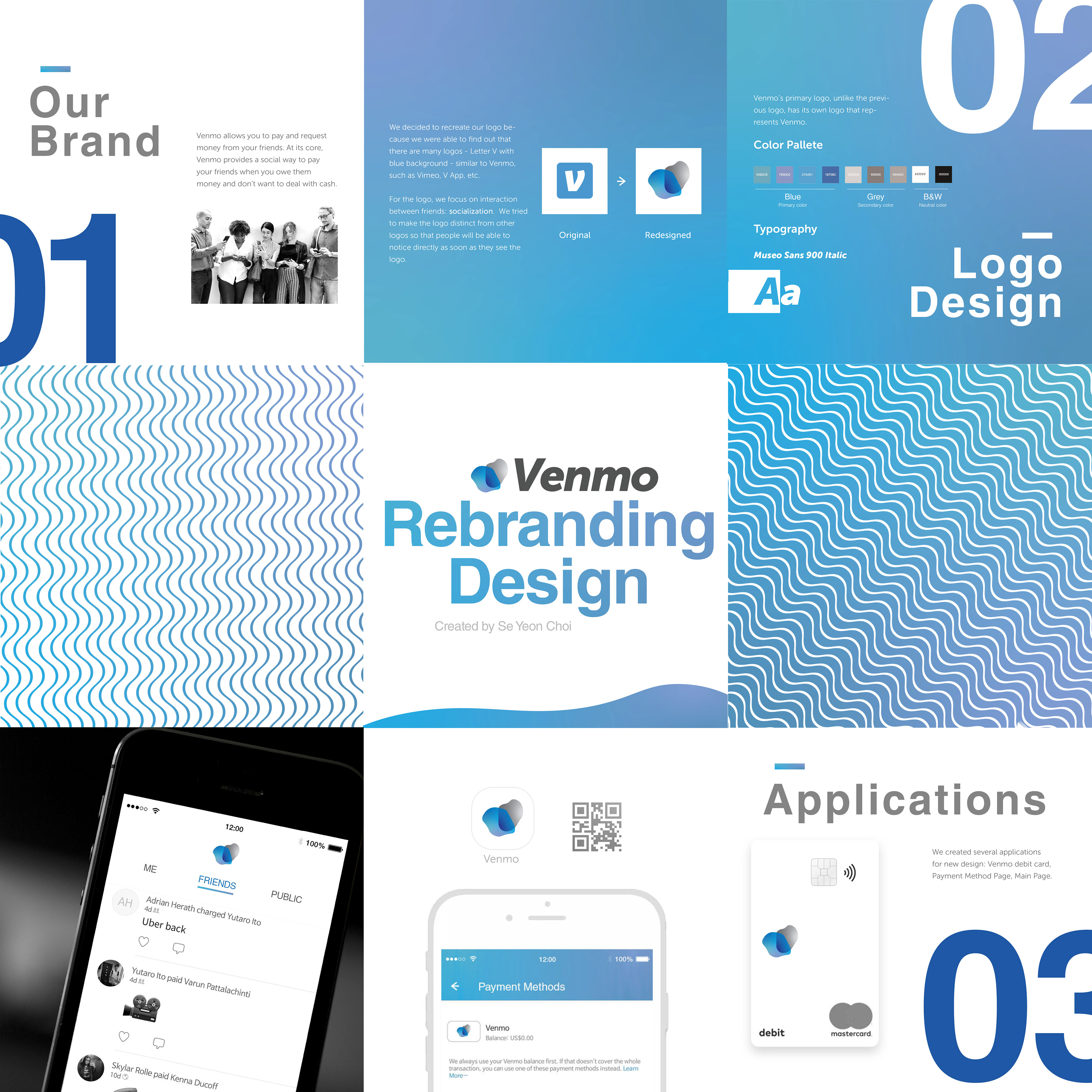
I chose Venmo to develop the brand identity further, since I thought that there are many logos that look similar to Venmo, such as Vimeo and V app; they both have the similar color (blue) and similar name with similar fonts. I believed that Venmo could be more developed and logo could have meanings to it.
MOOD BOARD
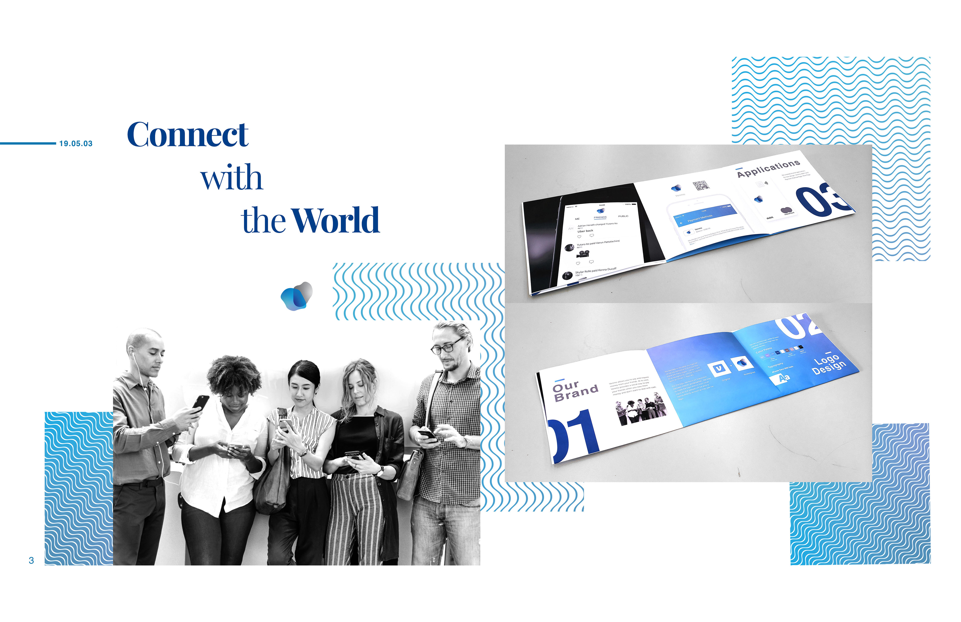
Inspirations: Wave, Blue, Lines - Connectivity
I thought the company focuses on interaction between friends -- exchange each other, so I looked up for several images related to interaction, money, and connection with something / someone.

OVERVIEW
Blue, Grey, B&W

BRANDING INSIGHTS
Why I chose VENMO for Rebranding Project
Venmo do not have specific design theory about their design, since they focus on the tool of exchange money between people. Venmo attempted to make the app and logo as simple as they could, so they decided to have the name itself only for their logo with blue color which represents interaction and money exchange. Their font is little tilted in order to represent the sending and receiving between people -- interacting each other.

BROCHURE